SKILL DEVELOPMENT COURSE - (DATA VISUALIZATION - R PROGRAMMING/ POWER BI)
Aim:
Getting started with Tableau Software using Data file formats, connecting your Data to Tableau,creating basic charts(line, bar charts, Tree maps),Using the Show me panel.
Solution :
Getting started with Tableau software is a great way to create data visualizations quickly and efficiently. Here are the steps to get started, including connecting your data to Tableau, creating basic charts like line charts, bar charts, and treemaps, and using the Show Me panel:
1. Download and Install Tableau:
First, you'll need to download and install Tableau Desktop or Tableau Public (a free version). Follow the installation instructions provided on the Tableau website for your specific operating system.
2. Prepare Your Data:
Before connecting your data to Tableau, ensure that your data is in a suitable format. Common data file formats that Tableau supports include Excel (.xlsx), CSV (.csv), and text files (.txt). Make sure your data is organized with headers for each column.
3. Connect Your Data to Tableau:
3.1 Launch Tableau Desktop.
3.2 Go to "File" Menu and then click on "Open".
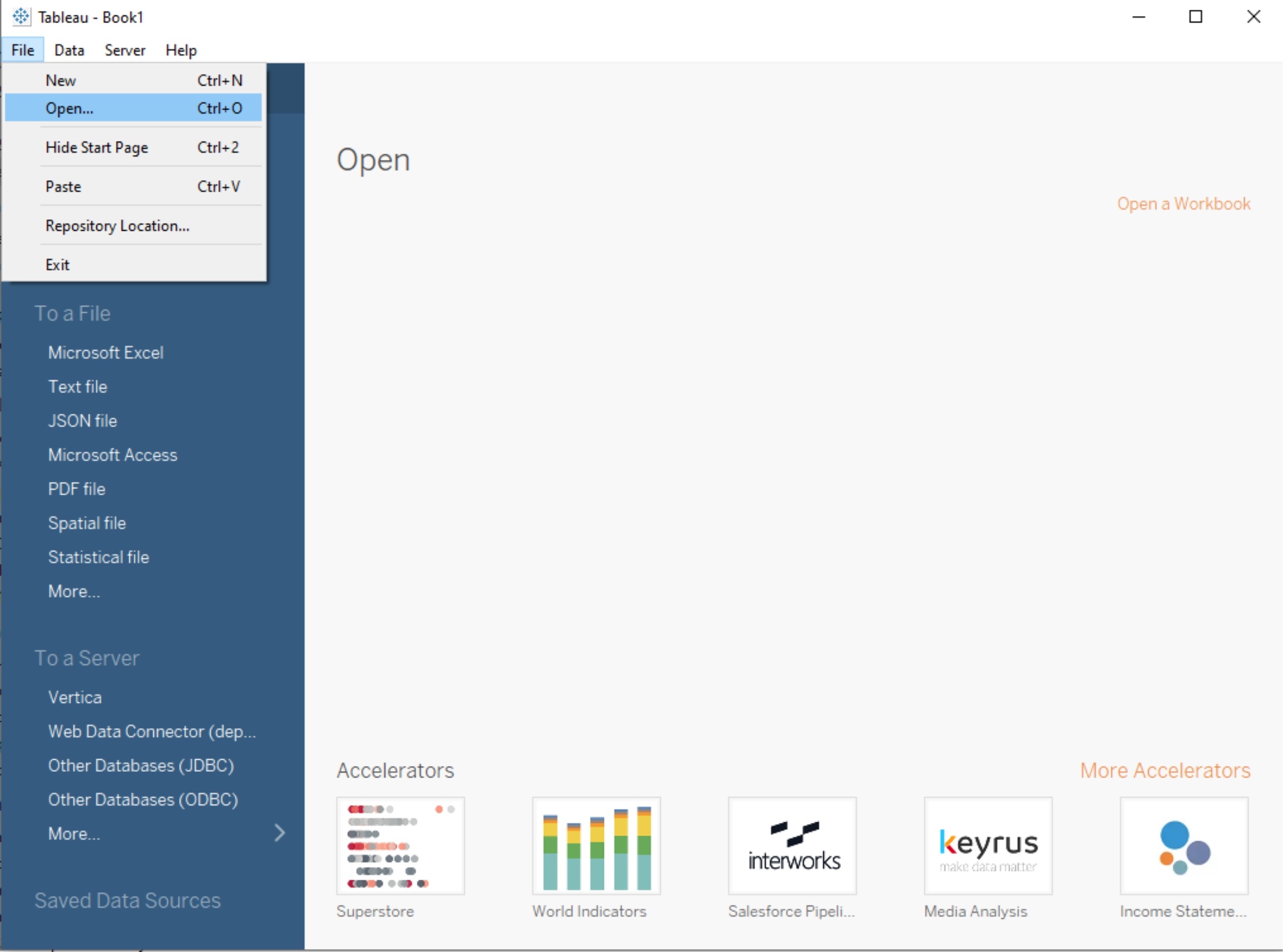
3.3 Choose the data source type (e.g., Excel, CSV, text file) and Select the data file(P6-SuperStoreUS-2015.xls) and click "Open".
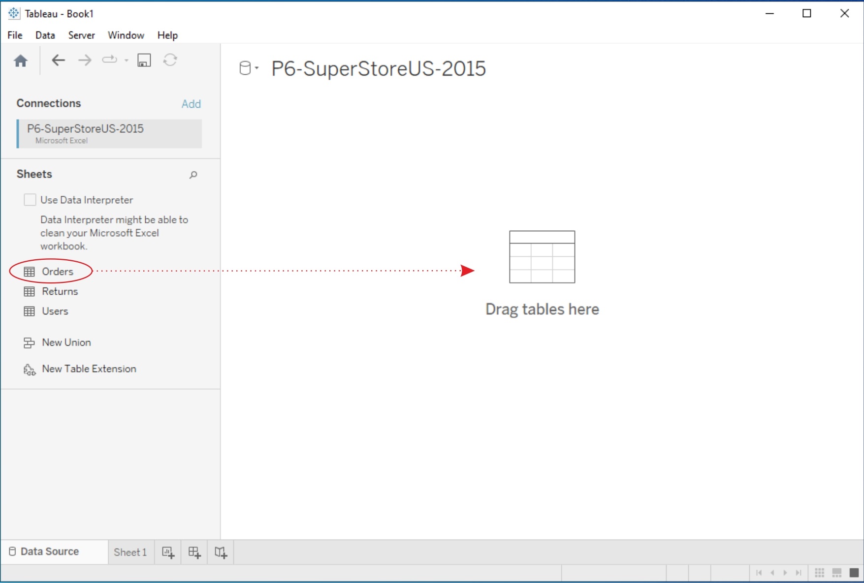
3.4 Drag any table(e.g. Orders) into working area.
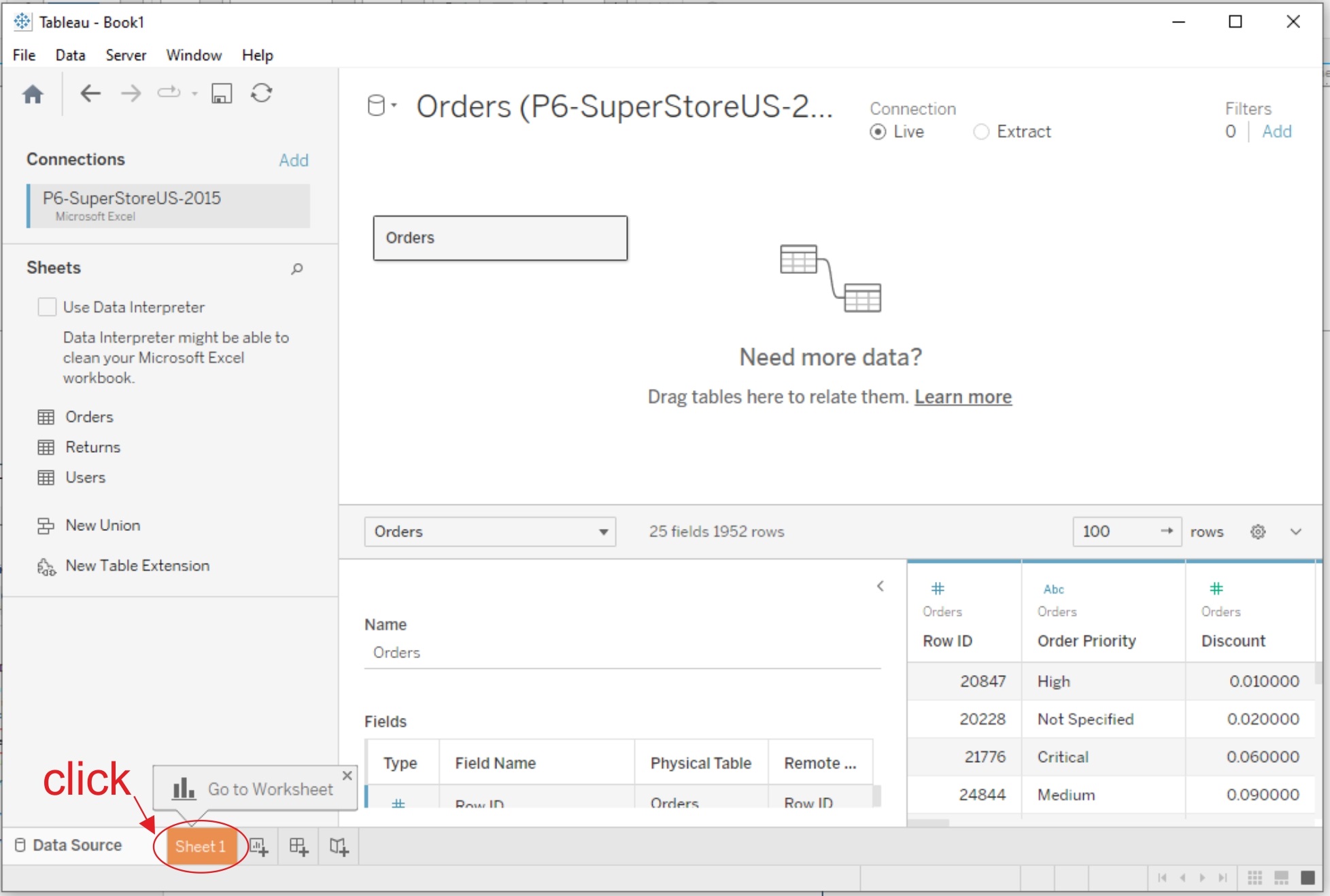
3.5 Click on Worksheet(Sheet1).
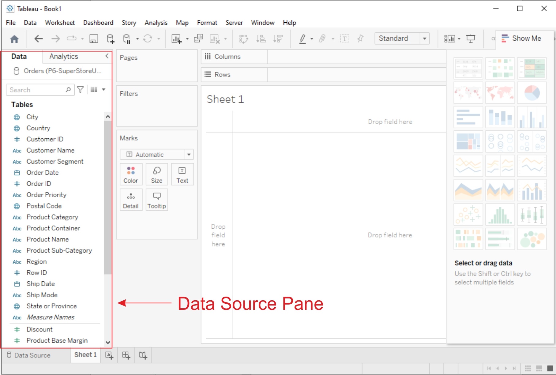
4. Data Source Pane:
Once your data is connected, the Data Source Pane will appear on the left-hand side of the Tableau interface. Here, you can see a preview of your data and perform data transformations or join multiple data sources if necessary.
5. Creating Basic Charts:
Now, let's create some basic charts using Tableau:
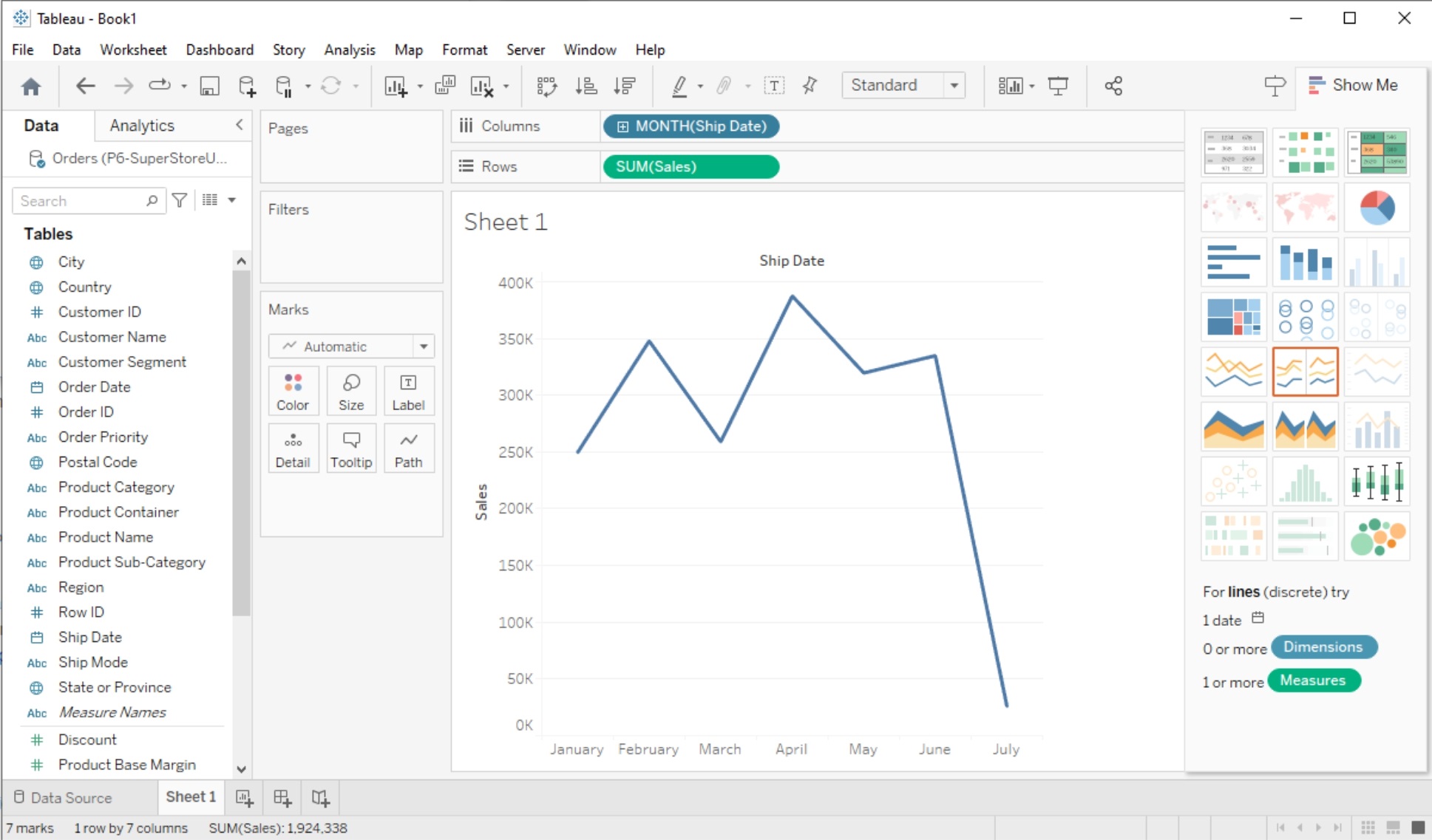
a. Line Chart:
1. From the "Data Source pane", drag and drop the date field to the Columns shelf and a numeric field (e.g., sales, revenue) to the Rows shelf.
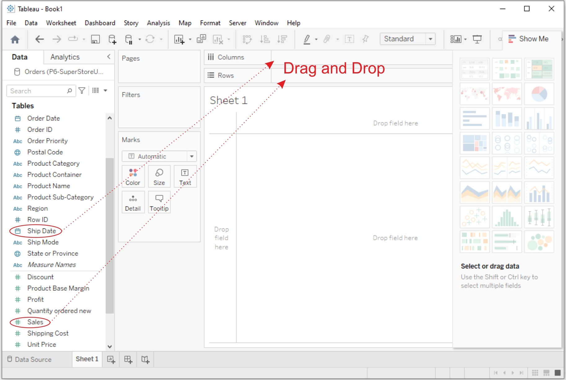
2. Then Tableau will automatically create a line chart. You can customize it by adding labels, titles, and formatting.
b. Bar Chart:
1. Drag and drop a categorical field (e.g., product category, region) to the Columns shelf and a numeric field to the Rows shelf.
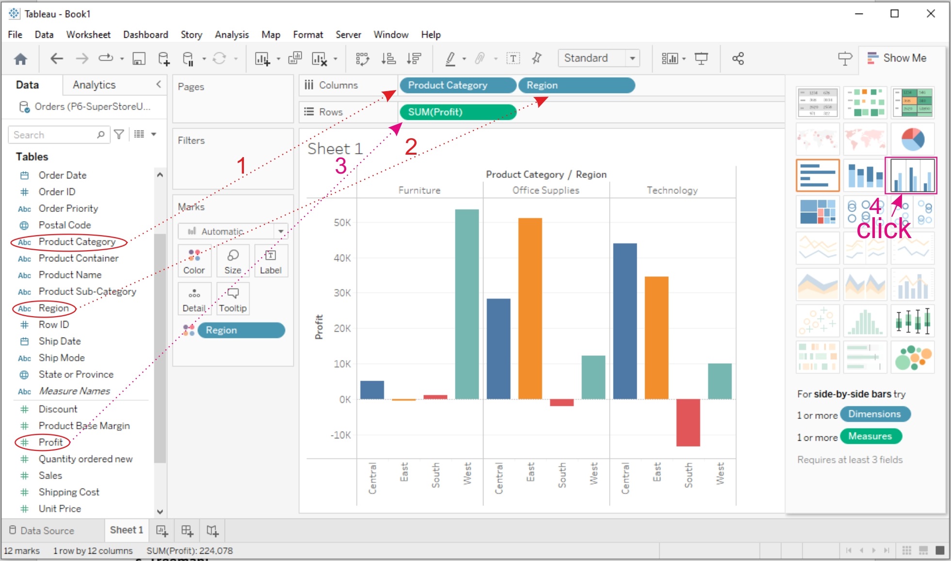
2. Then Tableau will create a bar chart. You can adjust the orientation and formatting as needed. To display Labels on the bars click on Lables and select "Show mark lables"

c. Treemap:
1. Drag and drop a categorical field to the Columns shelf.
2. Drag and drop a numeric field to the Size shelf.
3. Tableau will create a treemap visualization. You can further customize it by adjusting colors and labels.
6. Using the Show Me Panel:
The Show Me panel in Tableau helps you explore various chart types based on your data and the fields you select. Here's how to use it:
1. After adding fields to the Rows and Columns shelves, click on the "Show Me" panel located on the left side of the Tableau interface.
2. In the Show Me panel, you'll see a variety of chart options that Tableau recommends based on your data. Click on a chart type to create it.
3. Tableau will automatically generate the selected chart type with your data. You can further customize it as needed.
4. To go back to the regular worksheet view, click the "Clear" button in the Show Me panel.
Related Content :
Power BI Lab Programs
1) Understanding Data, What is data, where to find data, Foundations for building Data Visualizations,Creating Your First visualization? View Solution
2) Getting started with Tableau Software using Data file formats, connecting your Data to Tableau,creating basic charts(line, bar charts, Tree maps),Using the Show me panel. View Solution
3) Tableau Calculations, Overview of SUM, AVR, and Aggregate features, Creating custom calculationsand fields View Solution
4) Applying new data calculations to your visualizations, Formatting Visualizations, Formatting Toolsand Menus, Formatting specific parts of the view. View Solution
5) Editing and Formatting Axes, Manipulating Data in Tableau data, Pivoting Tableau data. View Solution
6) Structuring your data, Sorting and filtering Tableau data, Pivoting Tableau data. View Solution
7) Advanced Visualization Tools: Using Filters, Using the Detail panel, using the Size panels, customizing filters, Using and Customizing tooltips, Formatting your data with colors. View Solution
8) Creating Dashboards & Storytelling, creating your first dashboard and Story, Design for differentdisplays, adding interactivity to your Dashboard, Distributing & Publishing your Visualization. View Solution
9) Tableau file types, publishing to Tableau Online, Sharing your visualizations, printing, and Exporting. View Solution
10) Creating custom charts, cyclical data and circular area charts, Dual Axis charts. View Solution