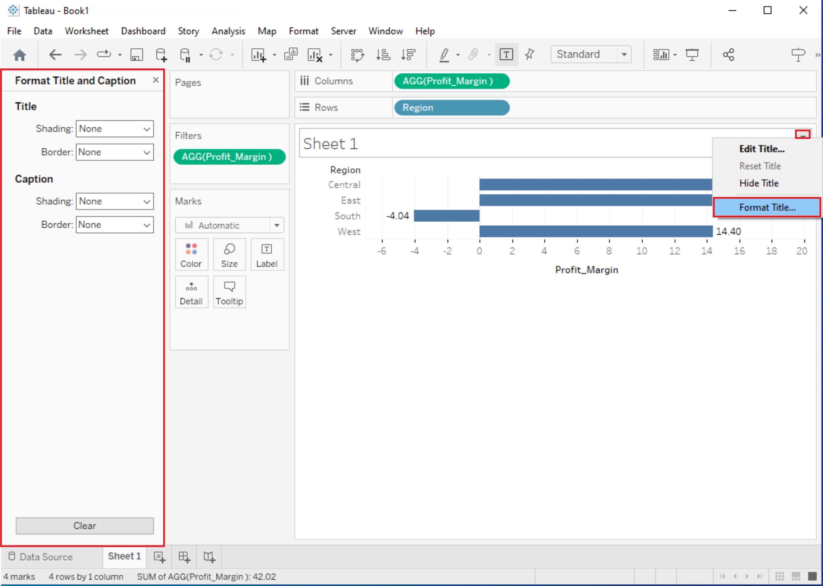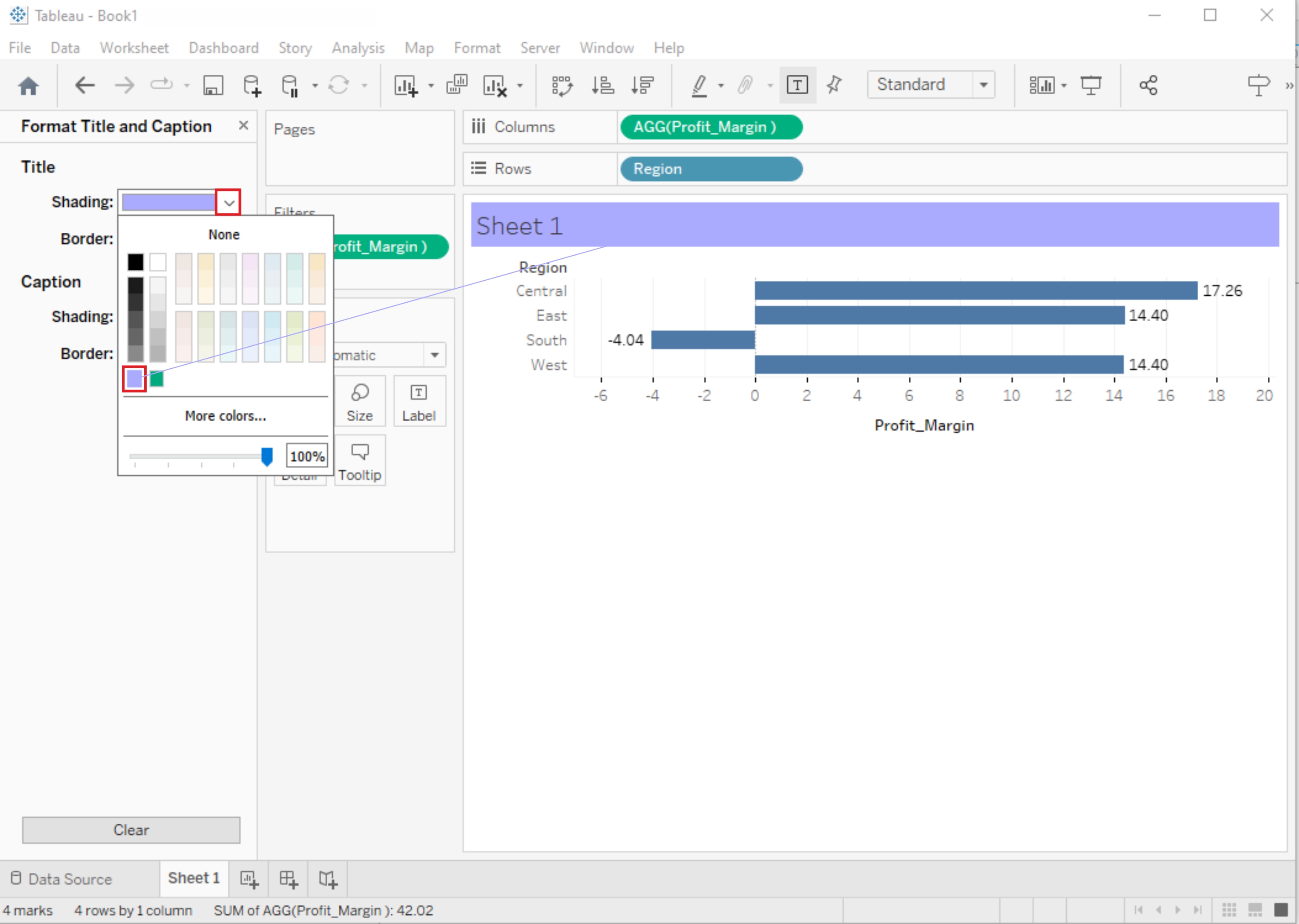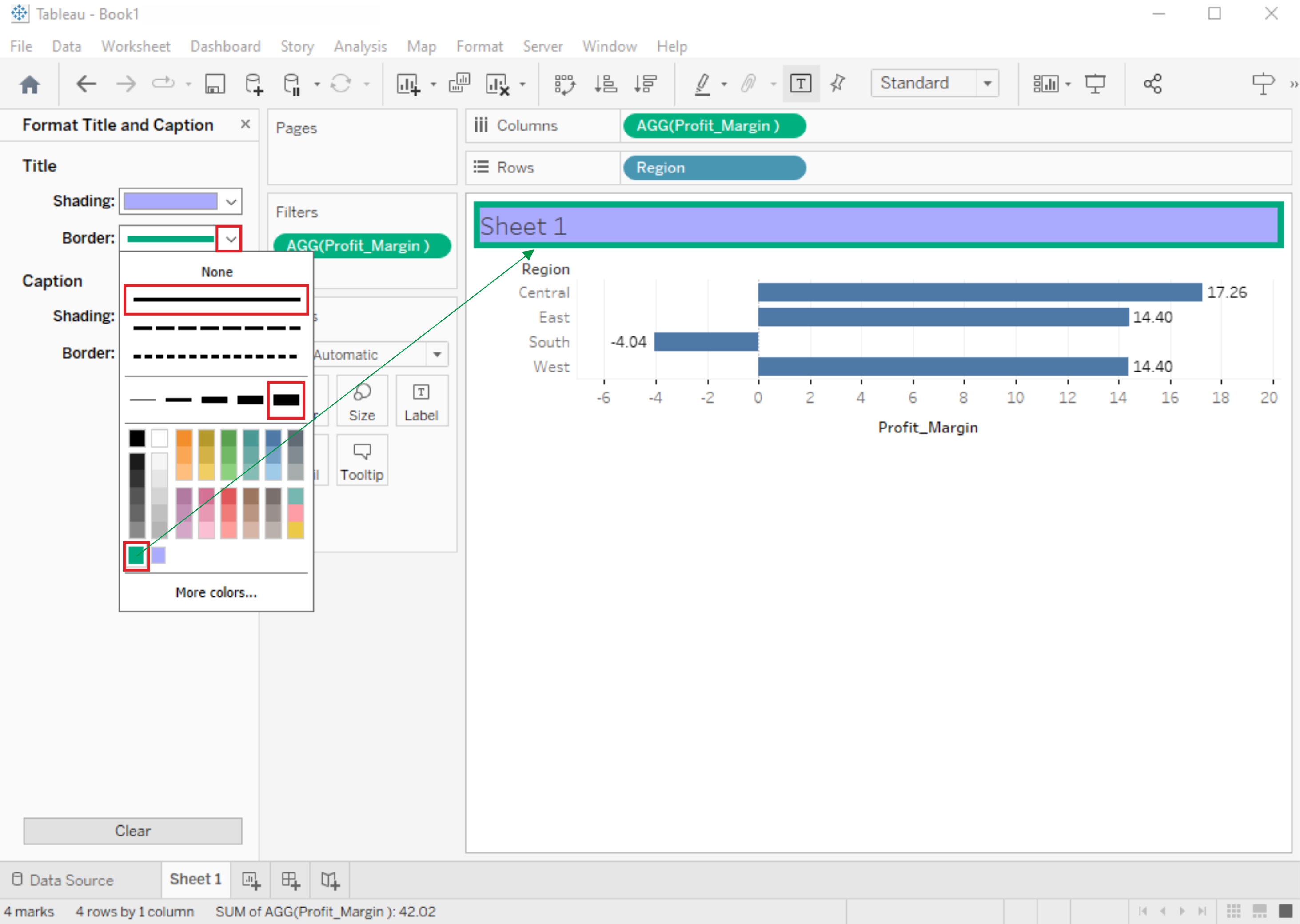
Applying new data calculations to your visualizations, Formatting Visualizations, Formatting Tools and Menus, Formatting specific parts of the view.
Applying New Data Calculations to Visualizations
1. Drag and Drop Calculated Fields:
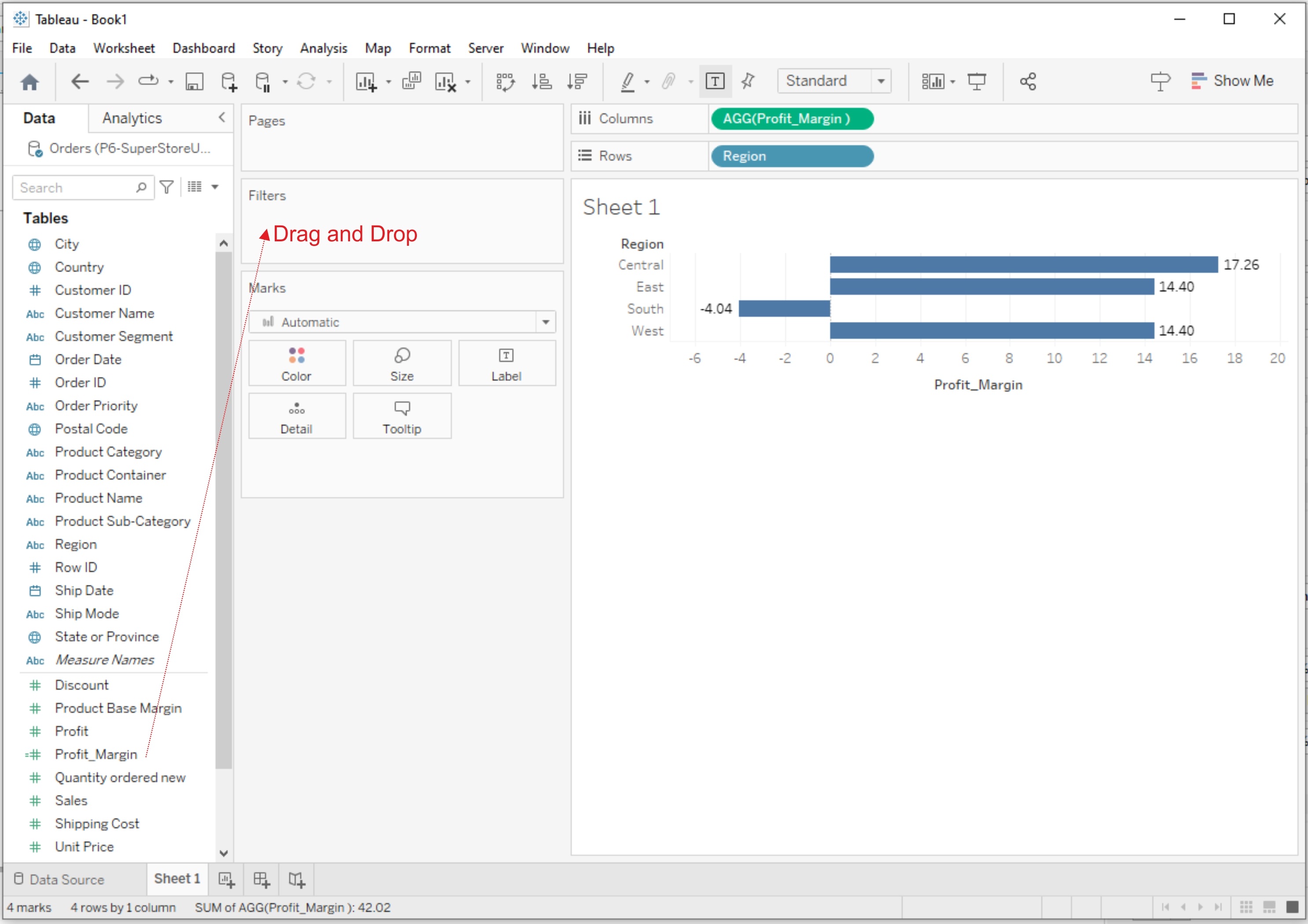
To apply your newly created calculated fields to a visualization, simply drag and drop them onto the appropriate shelves in your worksheet. For example, you can drag a calculated field to the Rows or Columns shelf, use it in filters, or place it on the Marks card to control the appearance of marks.
2. Filter with Calculated Fields:
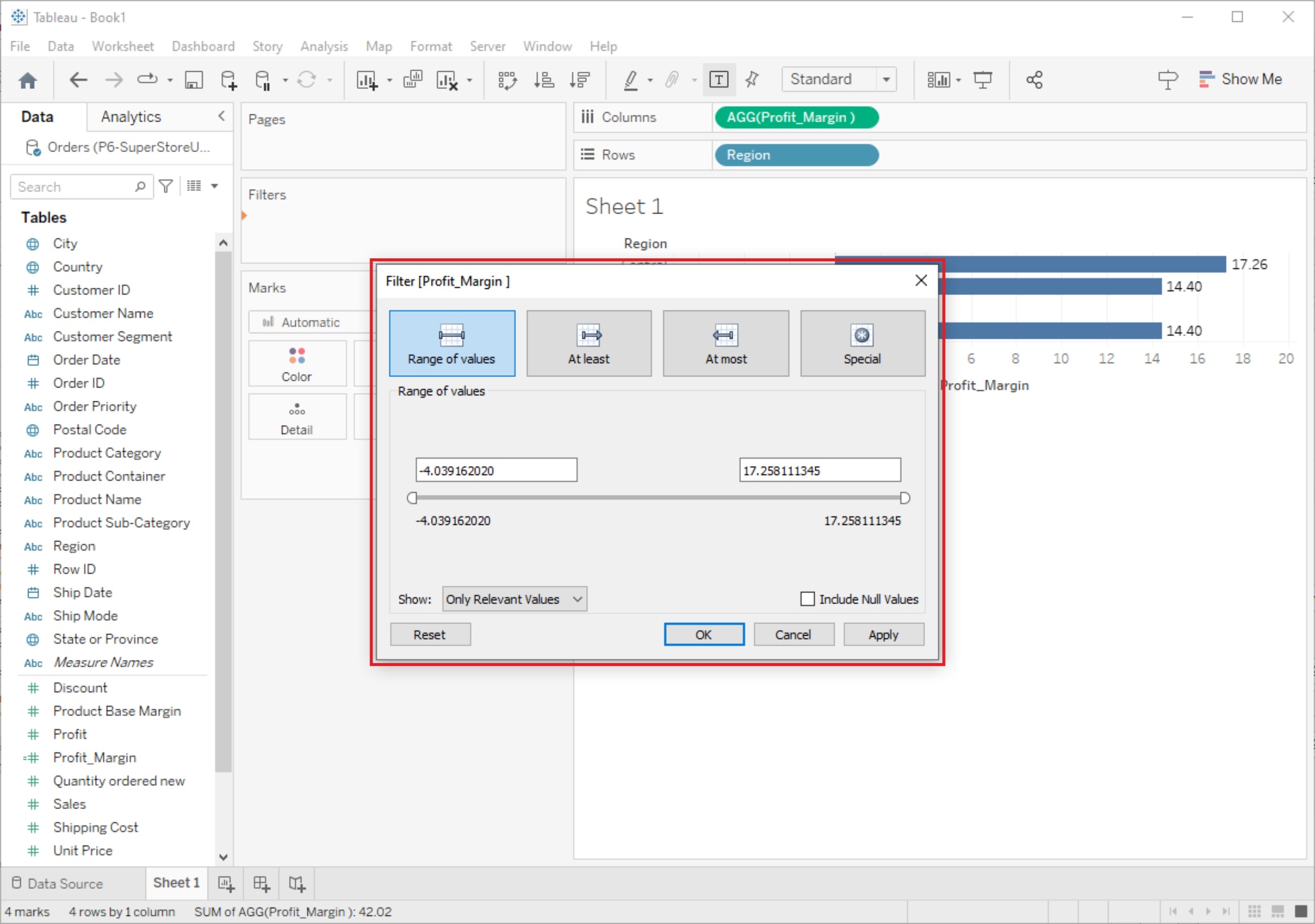
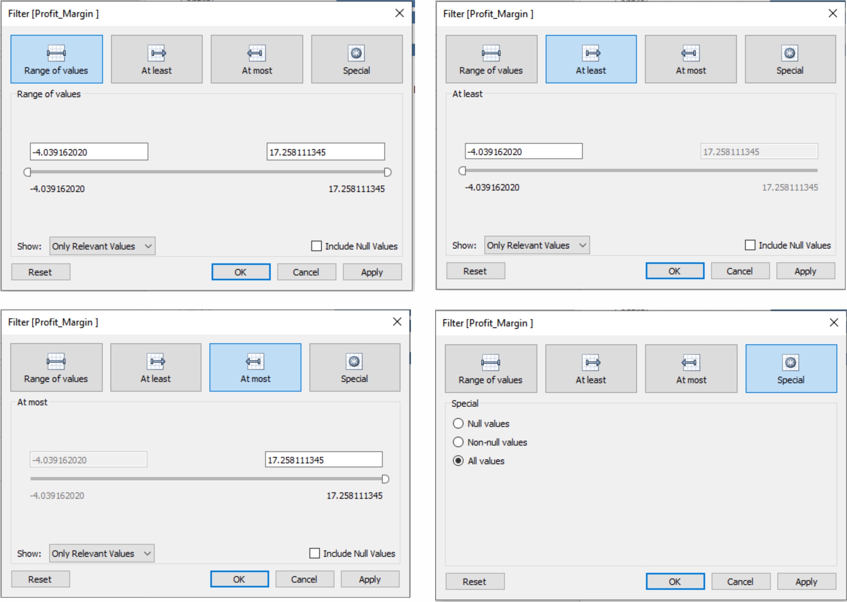
Create filters using calculated fields to control which data points are displayed in your visualization. You can use calculated fields to filter by specific criteria, such as a calculated date range or a custom ranking.

Formatting Visualizations
Tableau provides a wide range of formatting options to make your visualizations more appealing and informative:
1. Format Pane:
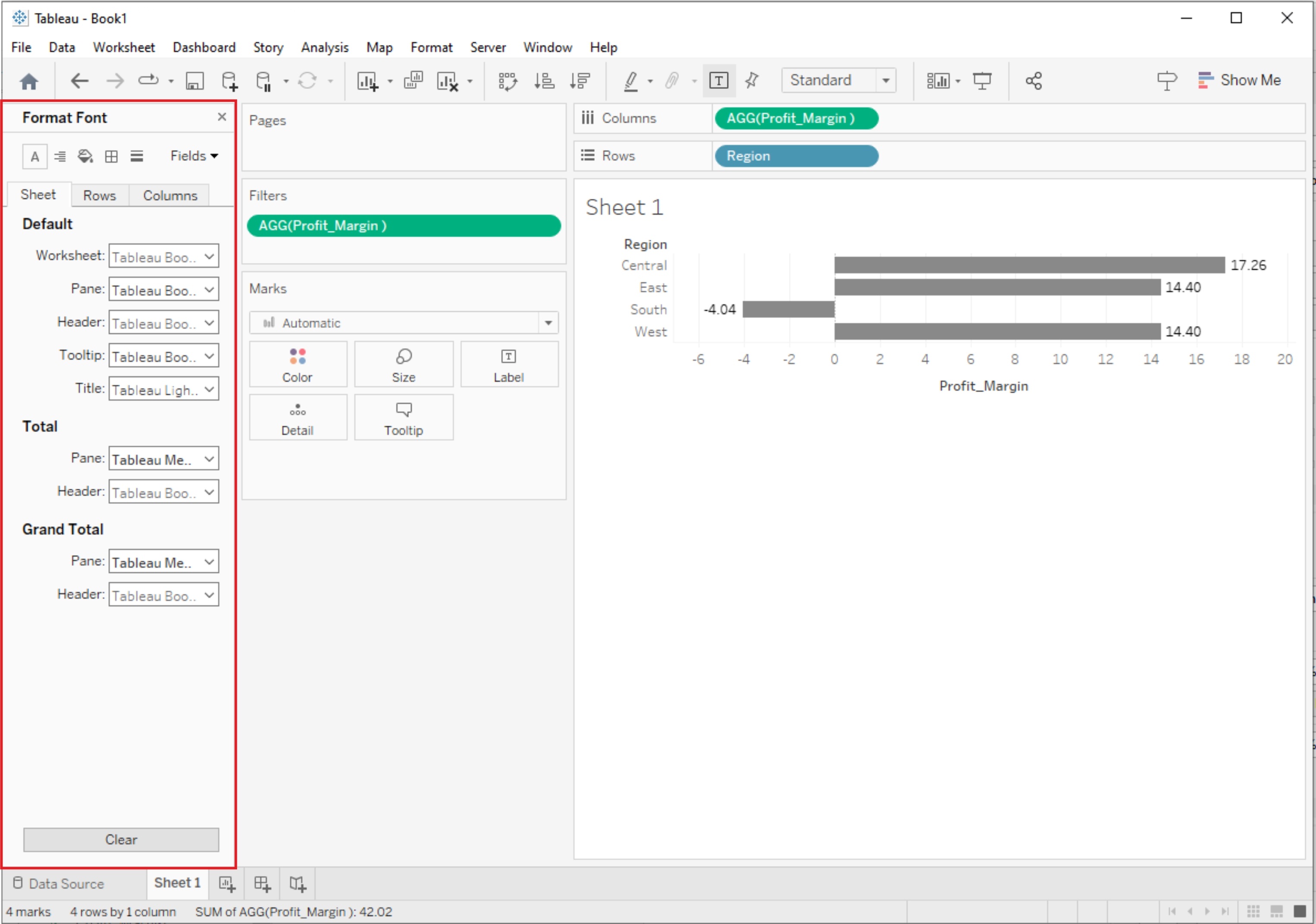
On the left side of the Tableau interface, you'll find the Format pane. It allows you to format various aspects of your visualization, such as fonts, colors, lines, shading, and borders. Simply select the element you want to format and use the options in the Format pane to make changes.
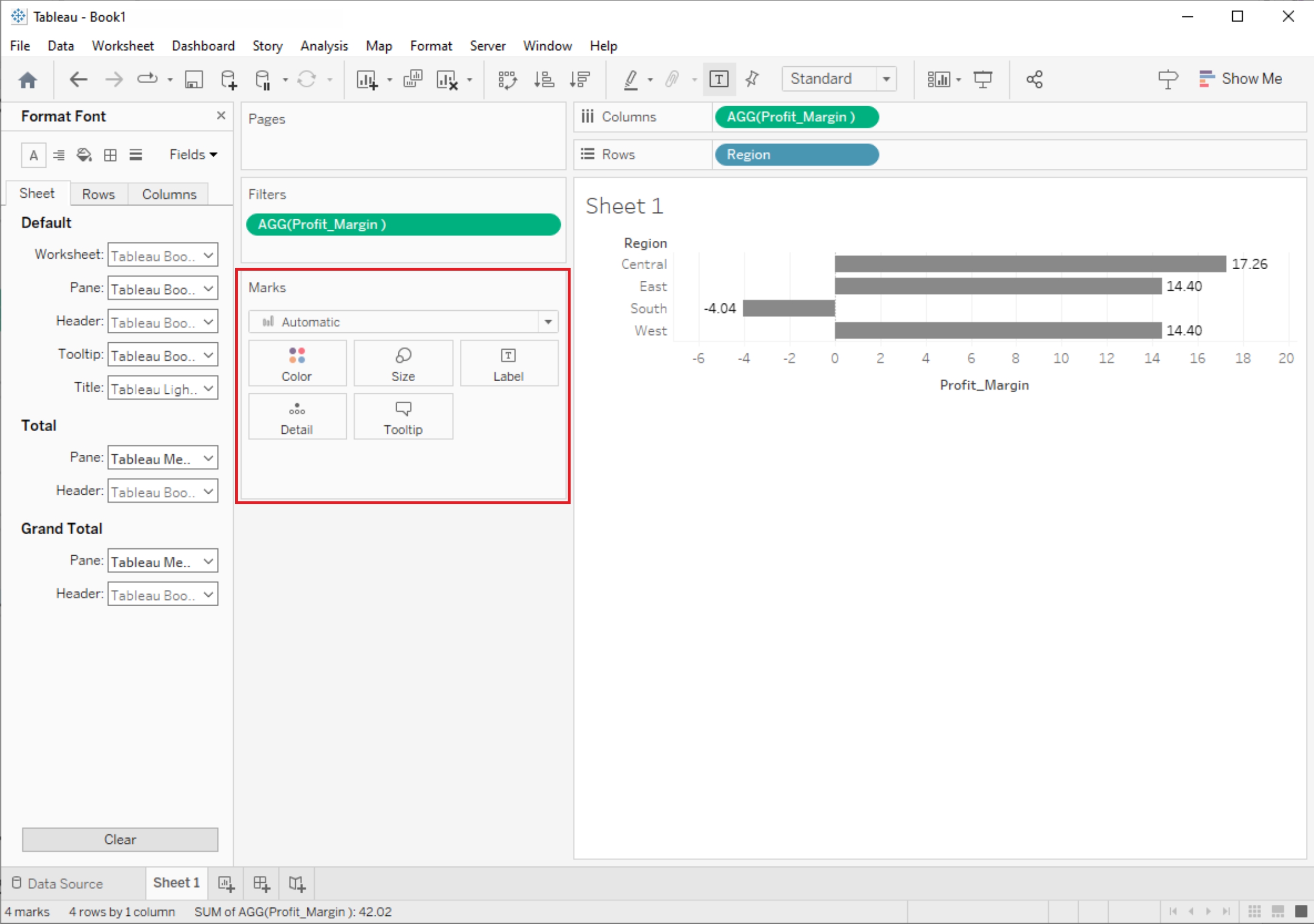
2. Marks Card:
The Marks card, located above your visualization, offers formatting options specific to the type of marks you're using (e.g., color, size, label). Click on the Marks card to access these options and modify how your data is represented.
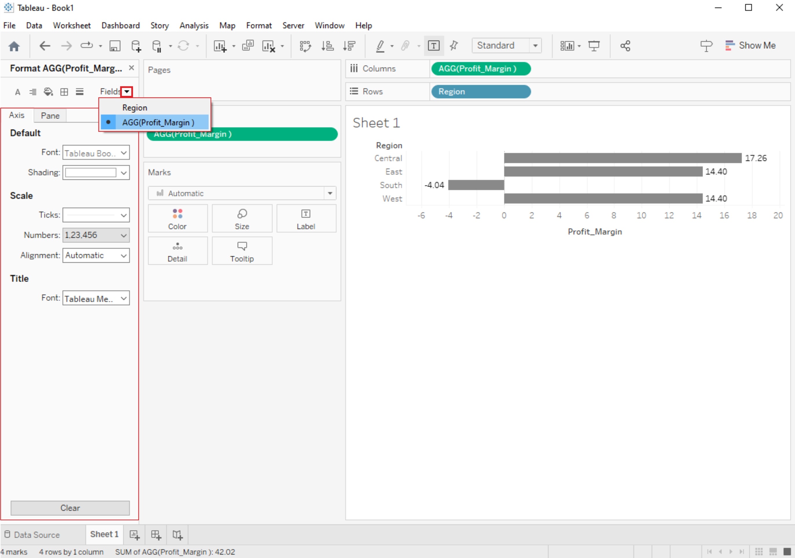
3. Axis and Gridlines:
You can format axis labels, titles, and gridlines to improve the readability of your visualization. Right-click on an axis or gridline to access formatting options.
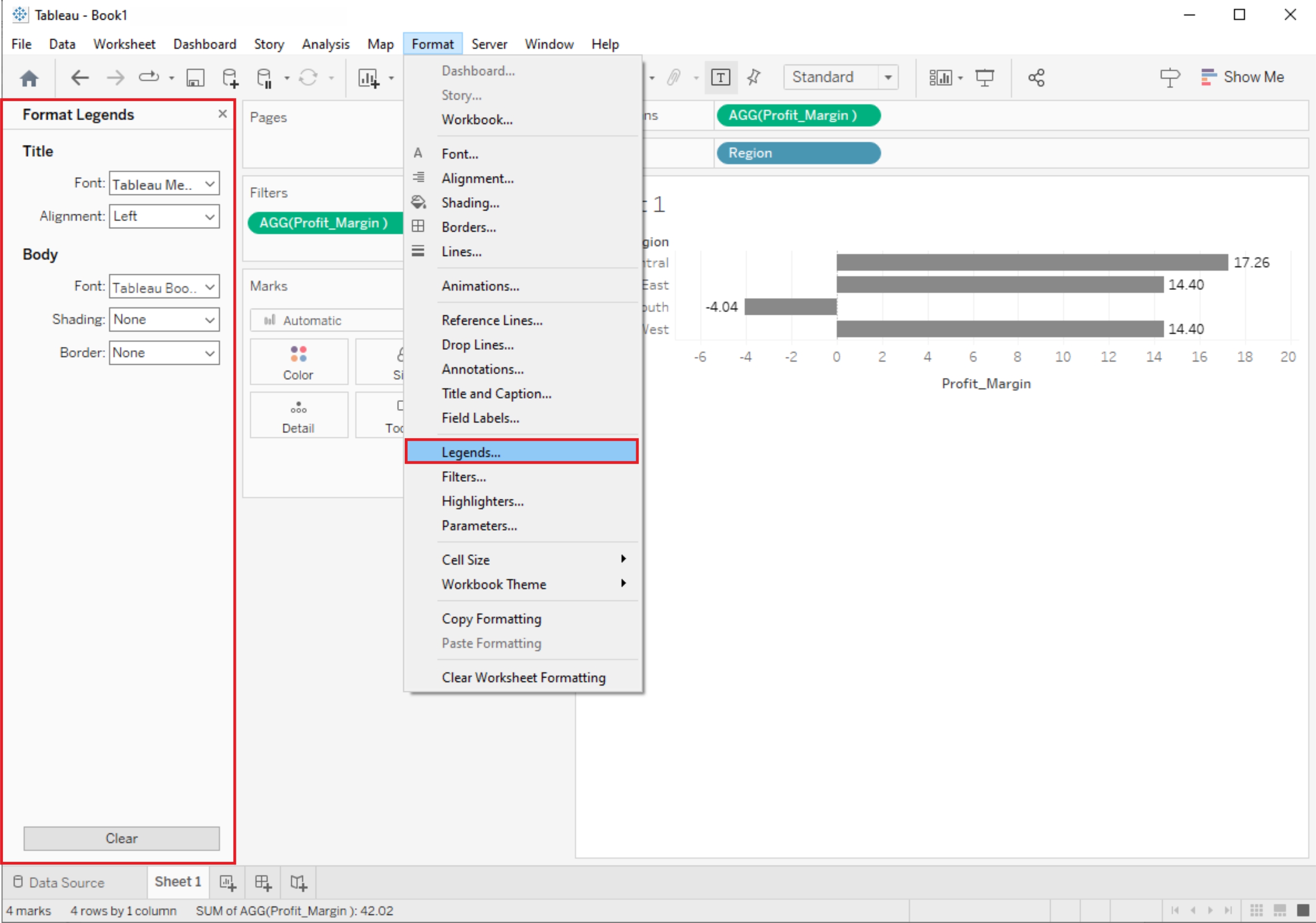
4. Legends and Color Scales:
Customize legends and color scales to provide context for your visualizations. You can change colors, labels, and the position of legends to match your data.
Formatting Tools and Menus
Tableau provides several formatting tools and menus to help you refine the appearance of your visualizations:
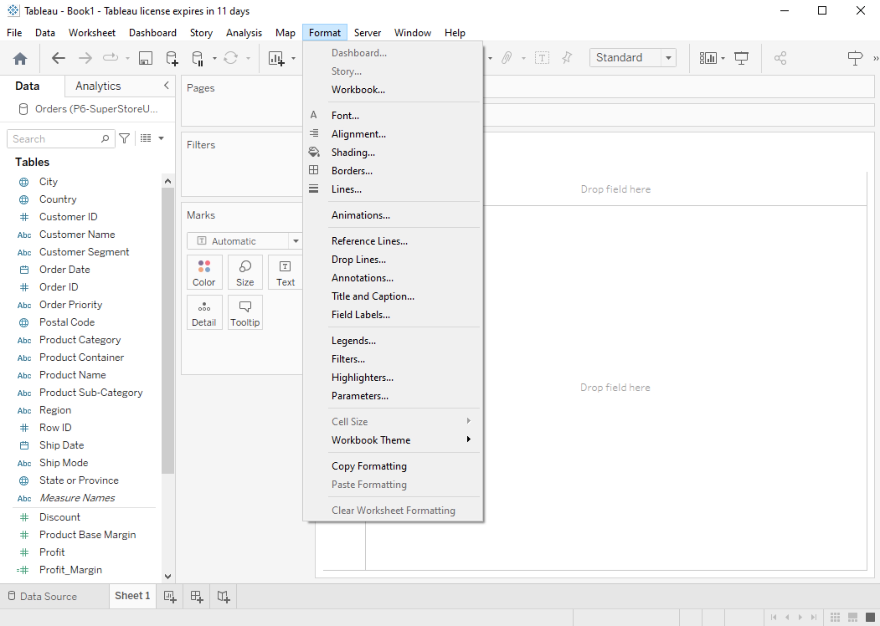
1. Format Menu:
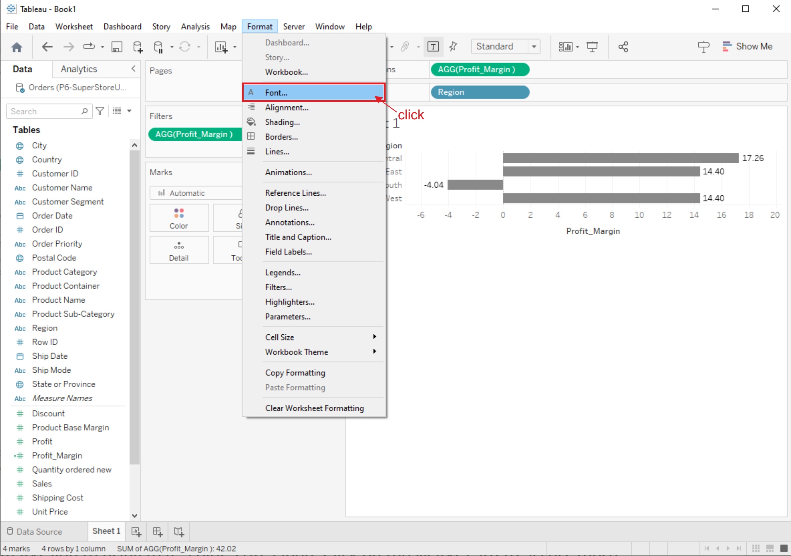
The Format menu at the top of the Tableau interface provides access to various formatting options, including font styles, shading, borders, alignment, and more. You can use this menu to format text, labels, and other elements.
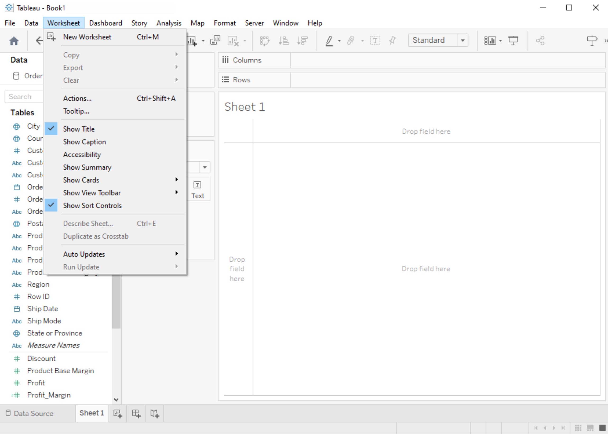
2. Worksheet Menu:
In the Worksheet menu, you'll find options to format the entire worksheet, including background color, borders, and worksheet title. You can also adjust the worksheet size.
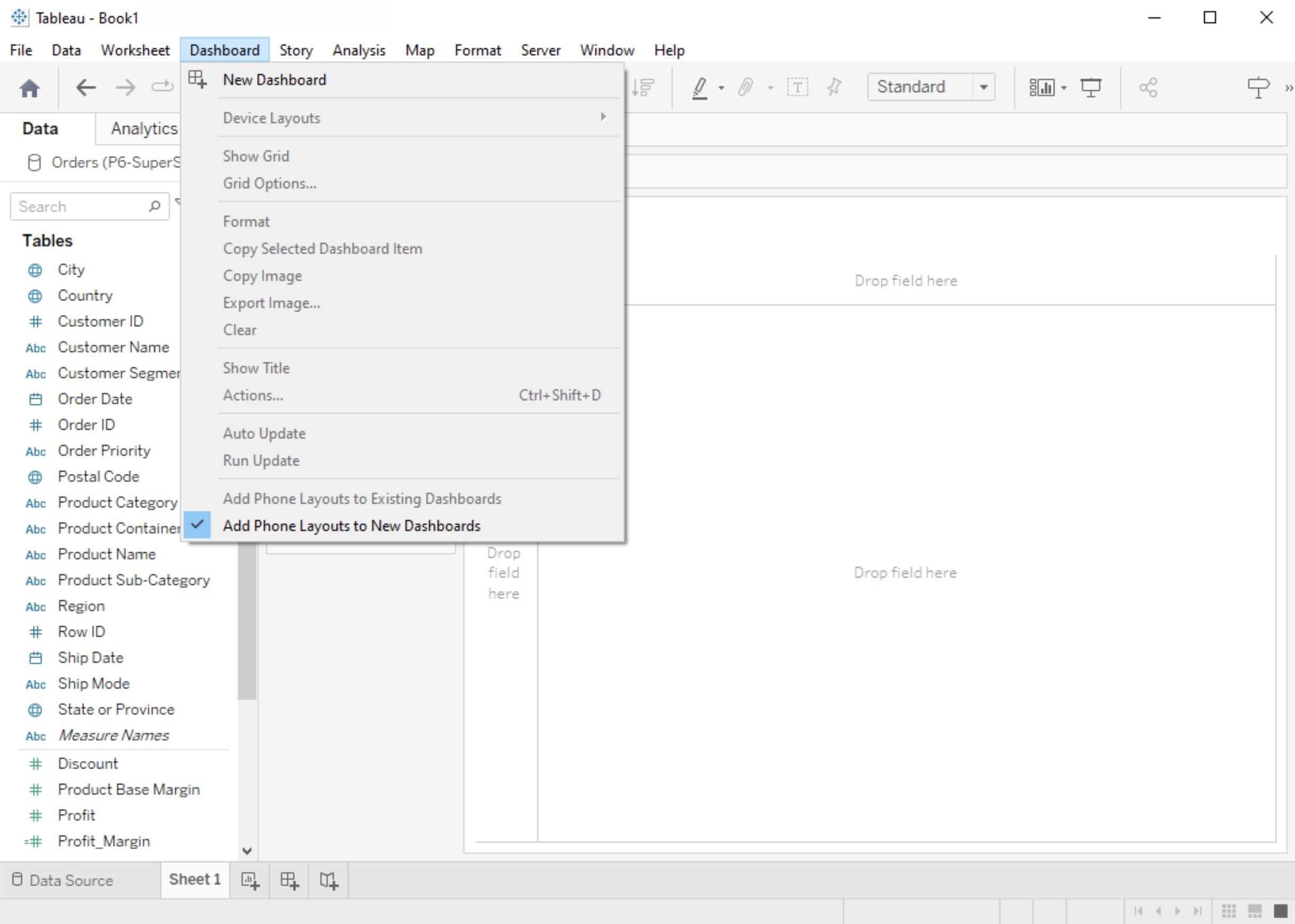
3. Dashboard Menu:
If you're working with dashboards, the Dashboard menu allows you to format the entire dashboard layout, including background, size, and title.
Formatting Specific Parts of the View
Tableau lets you format specific elements of your visualization:
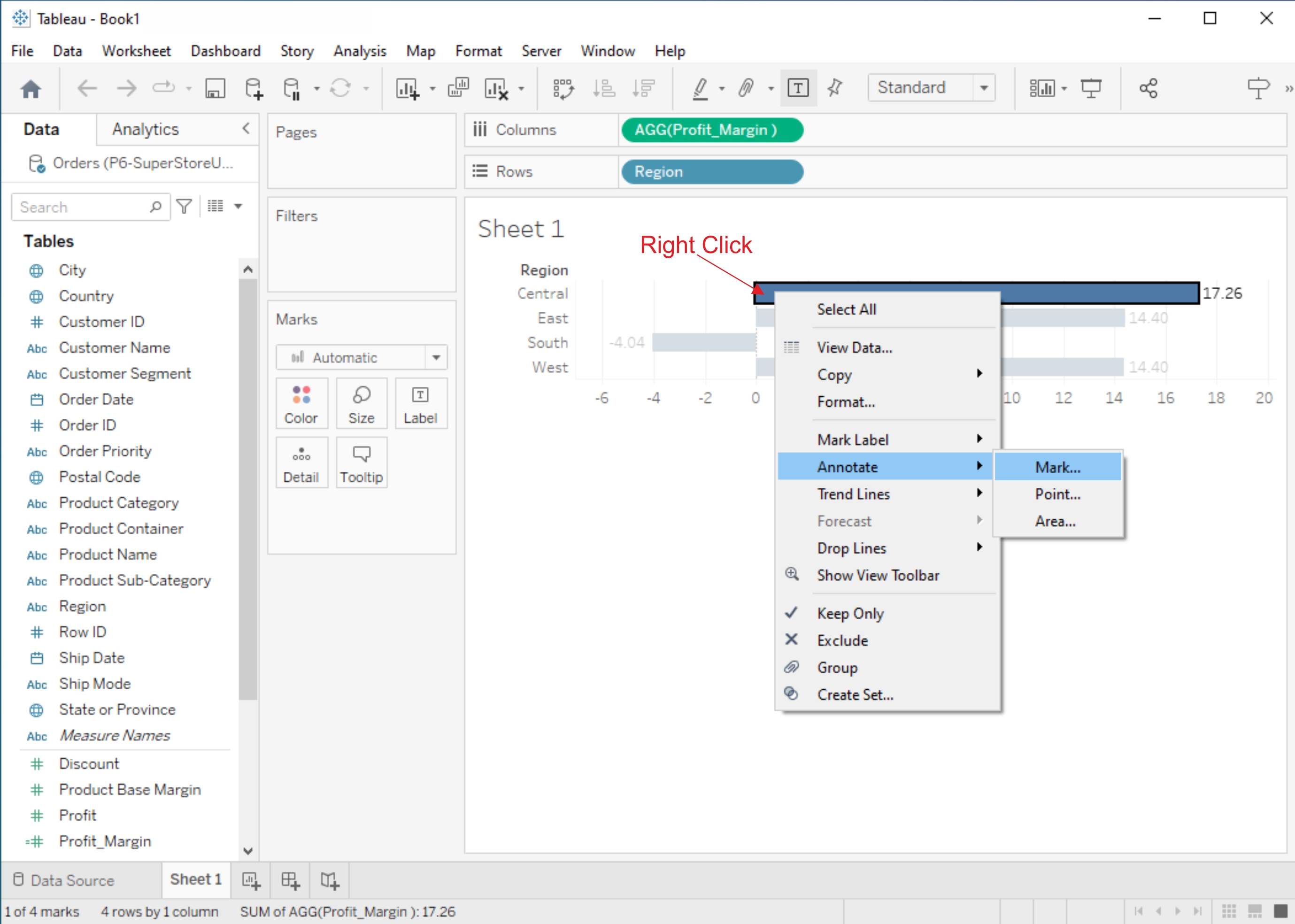
1. Annotations:
You can add annotations to your visualizations to highlight important points or provide additional context. Format these annotations using the options available when you right-click on an annotation.
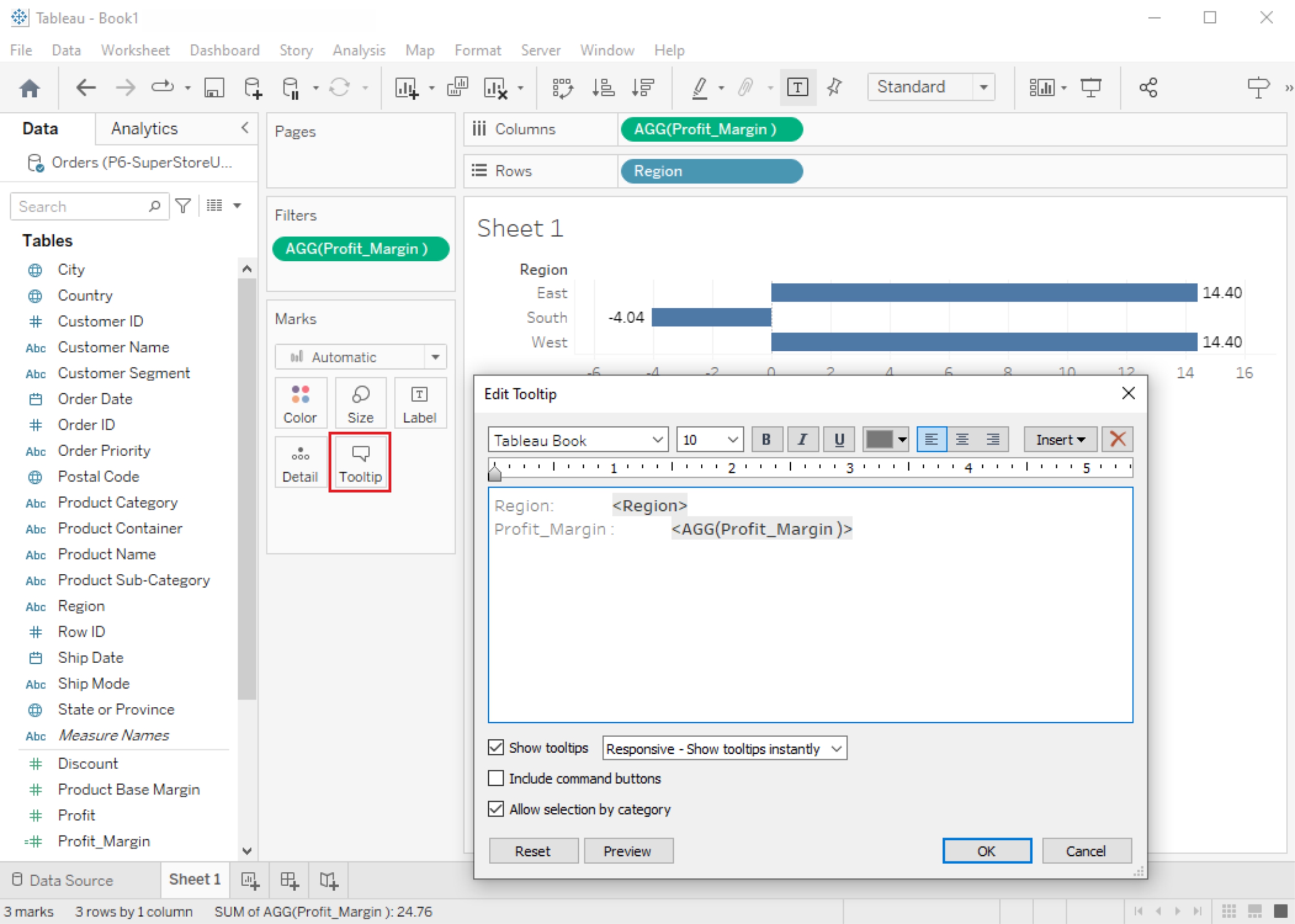
2. Tooltips:
Customize tooltips to display relevant information when users hover over data points. You can format tooltips to show or hide specific fields and control their appearance.
3. Headers and Titles:
Format headers, titles, and subtitles for clarity and consistency. Use the Format pane or the Format menu to adjust text formatting, alignment, and shading.